Dive Into The Depth of Dark UI
Dive Into The Depth of Dark UI
Dive Into The Depth of Dark UI
Sunny Haladker
Co-founder
Co-founder
5 Min ago
5 Min ago
12 Aug 2024
12 Aug 2024
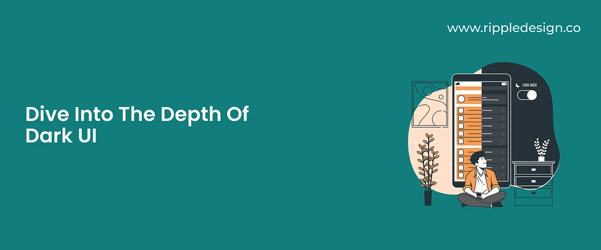


Recently, Google jumped into the bandwagon and rolled out the dark theme for its background, with LinkedIn following the lead. Although this has not come as a surprise as Twitter and Facebook have already embraced dark themes. Even if it is a mere go with the flow pattern, the vitality of dark UI has been highlighted again. With an additional choice of dark screen features for users, the underlying intention of these companies is to cut down eye strain, deliver promising readability, and suppress light sensitivity.
The radiant and comforting trend is preferred roughly by a whopping 91% of users, says the 2020 Android Authority report. So, are the UI/UX designers supporting the dark mode only because it is “in,” or if there is actually more to it? In this article, we will crack the hot takes on the dark interface for you!
Dark modes are pepping again since Google’s new interface launch. The already familiar interface is crawling in every software not only because it looks cool, but has several other advantages like enhancing usability and reducing eye strain.
The Functionality Of Dark UI
Colors have the power to convey intuitions and solicit emotions more loudly than we can imagine. Some experts of physics acknowledge black not as a color but as an absence of light. Therefore, black in the UI trends invokes power, mystery, sophistication, and, of course, aesthetics. But dark does not mean absolute black; it indicates attaining minimum color contrast ratios. The less luminance certainly creates a safe haven for users mainly because-
Sense of elevation and space- The dark modes are rather grey instead of being a flat, all-black design. Dark UIs are darker greys that plunge users with wider depths and express spacious elevation.
Energy conservation- The tech junk is already adding up to the pollution. Dark modes are a small step to conserve energy and save the environment. With low use of light pixels, dark screens conserve battery life, especially for the efficiency-generating devices with OLED screens.
Improved visual ergonomics- As already known, dark UIs minimize eye strain and come with an automated adaption of brightness according to the surroundings. The dark UIs are an advancement to meet accessible color contrast standards to enhance usability for users with vision issues.
The dark UI derives its functionality through limited color accents, desaturation, and minimal contrast. The dramatic “low-light” theme elucidates a wide range of depth and elevation. Therefore, along with being soothing to the eyes, it also addresses the dire need to conserve energy.
The Basics of Dark UI
The hype can aesthetically drive designers towards a dark UI. So, if a dark design is on your vision board, there are some discretionary rules you need to play by. To bring out the best of the dramatic and elegant potential of the dark theme, dive yourself into these basic principles of the trendy UI-
First things first, consider the visual and emotional impact of the UI- Many designers cannot resist their urge to follow the trend of a dark UI. Well, it’s not a problem unless they have the utmost regard for factors like culture, brand ideology, color psychology, etc. Indeed, striking a balance between aesthetics and emotional influence is a tough nut to crack! You can create a seamless flow with the dark theme for an entertainment UI, but the same will look odd for an informational site containing a large amount of text.
Designers have to predict the challenges they might face to adjust the standard web UI components on a dark UI as several color schemes don’t go well with the dark background. So, you just need to ensure that the dark and twisted norms fit your specific design; then, you are good to go!
Don’t confuse dark with black- No, not orange, but grey is the new black! As already mentioned, being diligent about the color schemes in a dark UI is quintessential for a smart designer. A dark design is not a black design but runs on grey undertones. Black can suit certain UI elements but should not be the ideal background color. On the other hand, a grey palette can express a broad range of colors and create a greater depth for the digital screens, leading to an alluring UI.
Be mindful about the textual contrast ratio - To gain text legibility, designers need to pass the test of the correct visual representation with a 4:5:1 text contrast ratio. And, for the large-scale text, it should be at least 3:1. This said, other UI elements such as icons, buttons, dropdowns should also have a proper contrast for the sake of separation. The clarity to distinguish between different elements saves the dark interface from becoming dull and boring.
Get the color scheme right with a limited color accent- If a designer passes the 4:5:1 text contrast ratio, it’s because they wisely choose the accented unsaturated color schemes. Visually, saturated colors vibrate against the dark surfaces and may look tacky. A Split Complementary Color scheme can save the day for designers. It’s about one dominant color and two adjacent colors that can help create a decent contrast for the dark UI. Moreover, now there are plenty of online tools available that may help you access compliant color combinations.
Preach minimalism for spacing in the dark UI- Many dark UIs tend to look heavy or overbearing. If you don’t want your design to suffer, count on negative space and minimalism to land you towards a successful and scannable design. Yes, you have to preach the ‘less is more’ mantra for dark screens. Minimalist designing and space between UI elements enhance the design definition. Negative space cuts the clutters and results in a breathable, high-quality dark interface.
A dark theme does not mean missing out on depth- Honestly, light themes are much painless than dark themes. A wider range of contrast, illumination, shades, and shadows create depth effortlessly in light designs. Conversely, a scant color accent in dark designs makes the designer work an extra mile to use three to four elevation levels to achieve satisfactory depth.
Without enough depth, the dark design may appear bland, and the hierarchy among the UI elements will be lost. If it becomes too grim to achieve the 15:8:1 between the dark surface and white text, a designer can use true black color for the text of elements. It can avoid stacking the surfaces and keep the background color dark enough with the 4:5:1 rule intact.
The Takeaway-
Hopefully, now you should have acknowledged that implementing a dark theme is much more than flexing the hip and trend. A designer has to be vigilant to approach the dark design. Contextual clarity of a digital product has a lot to do with the do’s and don'ts of the dark UI. For instance, if you are designing a fashion UI, it may come naturally, but it will look odd for a public welfare platform.
Therefore, from a smart rationale of choice, consideration for content and context, to the final outcome on a device, every piece has to be arranged cleanly. Thus, as the stylish frontiers await your new black design, explore it with an aesthetic but sensitive lens. So, what are you waiting for? Go unleash your dark side!


More Blogs
More Blogs
More Blogs
12 Aug 2024
•
5 Min ago
Testing in Design Thinking
The five stages of Design Thinking — Empathize, Define, Ideate, Prototype and Test — are not meant to be sequential steps to be taken as...
Sunny Haladker
12 Aug 2024
•
5 Min ago
10 types of prototypes
In the prototyping stage of design thinking, we try to explore the problem we have identified and ideated on. We create a sample to test...
Sunny Haladker

12 Aug 2024
•
5 Min ago
Design Thinking Phase 3 - Prototyping
Design thinking is a human centered, non linear iterative process that helps us understand our users or customers needs better, and...
Sunny Haladker


12 Aug 2024
•
5 Min ago
Testing in Design Thinking
The five stages of Design Thinking — Empathize, Define, Ideate, Prototype and Test — are not meant to be sequential steps to be taken as...
Sunny Haladker


12 Aug 2024
•
5 Min ago
10 types of prototypes
In the prototyping stage of design thinking, we try to explore the problem we have identified and ideated on. We create a sample to test...
Sunny Haladker


12 Aug 2024
•
5 Min ago
Design Thinking Phase 3 - Prototyping
Design thinking is a human centered, non linear iterative process that helps us understand our users or customers needs better, and...
Sunny Haladker


12 Aug 2024
•
5 Min ago
Testing in Design Thinking
Testing in Design Thinking
The five stages of Design Thinking — Empathize, Define, Ideate, Prototype and Test — are not meant to be sequential steps to be taken as...
Sunny Haladker


12 Aug 2024
•
5 Min ago
10 types of prototypes
10 types of prototypes
In the prototyping stage of design thinking, we try to explore the problem we have identified and ideated on. We create a sample to test...
Sunny Haladker


12 Aug 2024
•
5 Min ago
Design Thinking Phase 3 - Prototyping
Design Thinking Phase 3 - Prototyping
Design thinking is a human centered, non linear iterative process that helps us understand our users or customers needs better, and...
Sunny Haladker


12 Aug 2024
•
5 Min ago
Testing in Design Thinking
The five stages of Design Thinking — Empathize, Define, Ideate, Prototype and Test — are not meant to be sequential steps to be taken as...
Sunny Haladker


12 Aug 2024
•
5 Min ago
10 types of prototypes
In the prototyping stage of design thinking, we try to explore the problem we have identified and ideated on. We create a sample to test...
Sunny Haladker


12 Aug 2024
•
5 Min ago
Design Thinking Phase 3 - Prototyping
Design thinking is a human centered, non linear iterative process that helps us understand our users or customers needs better, and...
Sunny Haladker
More Blogs


12 Aug 2024
•
5 Min ago
Testing in Design Thinking
The five stages of Design Thinking — Empathize, Define, Ideate, Prototype and Test — are not meant to be sequential steps to be taken as...
Sunny Haladker


12 Aug 2024
•
5 Min ago
10 types of prototypes
In the prototyping stage of design thinking, we try to explore the problem we have identified and ideated on. We create a sample to test...
Sunny Haladker


12 Aug 2024
•
5 Min ago
Design Thinking Phase 3 - Prototyping
Design thinking is a human centered, non linear iterative process that helps us understand our users or customers needs better, and...
Sunny Haladker